Theming
Three layers, in priority order:
- CSS variables — instant override; works inside Shadow DOM.
ThemeConfig— JSON object passed to the store; renders to a CSS variable map at runtime.- Defaults —
DEFAULT_THEME(indomain/value-objects/Theme.ts).
CSS variables
Set on :root or any ancestor of <chat-iva>. They pierce the Shadow DOM:
chat-iva {
  --chativa-primary-color:    #4f46e5;
  --chativa-secondary-color:  #6c757d;
  --chativa-background-color: #ffffff;
  --chativa-text-color:       #212529;
  --chativa-border-color:     #dee2e6;
}
The store's setTheme() ultimately writes these same variables via themeToCSS().
ThemeConfig
Full schema: schemas/theme.schema.json. Field-by-field reference: configuration → ThemeConfig.
import { chatStore } from "@chativa/core";

chatStore.getState().setTheme({
  colors: { primary: "#0ea5e9", secondary: "#0284c7" },
  position: "bottom-left",
  size: "large",
  layout: { width: "400px", height: "600px" },
});
Window modes
| Mode | Behaviour |
|---|---|
popup (default) | Floating card anchored to the launcher. |
side-panel | Full-height drawer docked to the viewport edge. |
fullscreen | Covers the whole viewport. Always used on mobile (<480 px). |
inline | Positioned statically inside its parent — for embedding in a page section. |
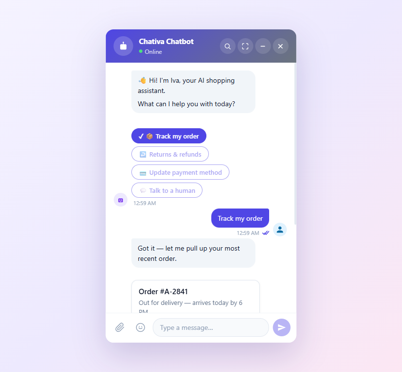
Popup (default — floating card)
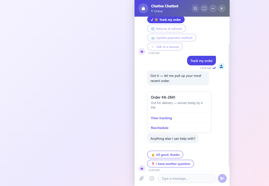
Side panel (full-height drawer)
Fullscreen (covers the viewport)
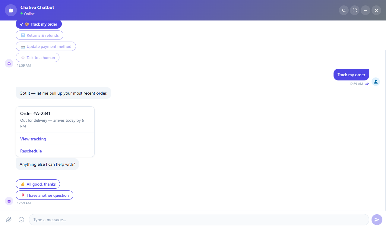
Captured from the live sandbox. The
inlinemode looks the same aspopupwhen no parent layout constrains it — drop the widget inside any container to see the difference.
Avatars
chatStore.getState().setTheme({
  avatar: {
    bot:    "https://example.com/bot.png",
    header: "https://example.com/header.png",
    user:   "https://example.com/user.png",
    showBot:  true,
    showUser: false,
  },
});
Omit any URL to fall back to the default SVG.
Custom launcher button
The launcher accepts both a slot and a ::part(launcher) selector:
<style>
  chat-bot-button::part(launcher) {
    border-radius: 24px;
    width: 140px;
    height: 48px;
    background: linear-gradient(135deg, #e91e63, #ff5722);
  }
</style>

<chat-bot-button>
  <span style="color:white;font-weight:600;">💬 Bize Yazın</span>
</chat-bot-button>
When a custom launcher is used, set hideButtonOnOpen: true to hide it while the chat is open.
Fluent builder
import { ThemeBuilder } from "@chativa/core";

const theme = ThemeBuilder.create()
  .setPrimary("#0ea5e9")
  .setBackground("#1e1e2e")
  .setText("#f8fafc")
  .setPosition("bottom-left")
  .setSize("large")
  .setShowMessageStatus(true)
  .setEnableSearch(false)
  .build();

chatStore.getState().setTheme(theme);
The Chrome extension (chrome-extension) generates this exact builder code from a visual editor — handy for "design now, paste into your app later" workflows.
Live preview
The sandbox lets you tweak every field and see the result instantly: chativa.aimtune.dev/sandbox.